What Is the Best Color to Paint Office Walls?
Environmental designers and color psychologists specialize in determining the effect of color on human thought and activity. Colors for logos and product packaging are carefully calculated to have an effect, such as evoking trust in a brand or inspiring action to sell a product. So how can you use color psychology to choose the best paint color for your office?
Color Reaction Is Subjective
As you may imagine when dealing with human emotional responses, there are perception differences (along with pros and cons) to every office color choice. Individual past experiences and associations with a particular color can affect how we react, so there are no universal rules. However, there are a few considerations to keep in mind before you repaint your workspace:
Optimal Office Wall Colors
Considering productivity and employee morale, here’s why you might, or might not, want to select:
White: If you’re considering white for a “clean” look or to make your work space appear larger, you may want to rethink the strategy and add at least a subtle color to your walls. Experts have commented that white walls lead to boredom and self-reflective daydreaming, rather than allowing workers to concentrate on their jobs.
Red: The expression “seeing red” might give you a clue to the typical human reaction to red: it inspires fast, short-term forceful action, according to an APA (American Psychological Association) published study. This color might be suitable for a sports venue, but not an office. In a work setting, red can be distracting or anxiety-producing. Still, red may have a place in enhancing detail-oriented task performance, according to Science magazine research.
Blue-green: This office color scheme was highly rated in a survey reported by color experts Pantone. Some of the reasons may be that green and blue are found in nature’s calm environments. Science magazine also notes that blue hues may be especially motivating for creative tasks. Paler versions were preferred over brilliant hues, because the latter can be stimulating or distracting.
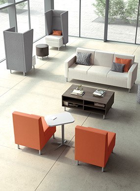
Neutral pale colors: Many experts, including the Color Marketing Director for Sherwin-Williams and the Milliken blog, responded that a neutral palette for workplace walls can be ideal to promote a calm environment and avoid eye fatigue. (Scroll down on the linked page for office color sample swatches.) Consider light gray or beige, perhaps accented with small doses of stronger color: for instance, bright artwork and bold colors on some of your office furniture or accent walls.
Color May Affect Temperature, Too
Is your office too cold or too warm? Save on energy bills by painting the uncomfortable areas either a peachy color or a cool pale blue. These shades can make the room “feel” warmer or cooler, affecting your sense of temperature, according to a number of experts.
Call Zoom Inc. for Interior Design Services in the Mid-Atlantic
Let Zoom Inc. assist you nationwide with any office furniture need, in any color scheme. Call us today at 301-299-7155 or contact us online.
Why Zoom Inc.?
We offer you the best value solution because you will receive the best service. Our job is to make yours easier.
Services
From consultations and project management to specification and design, Zoom Inc. exceeds our clients’ expectations.
Our Blog
Read about what is going on at Zoom Inc. and in the world of furniture.
Past Performance Projects
Zoom Inc. has provided exceptional turnkey design, manufacturing, and installation solutions to several federal and commercial agencies.